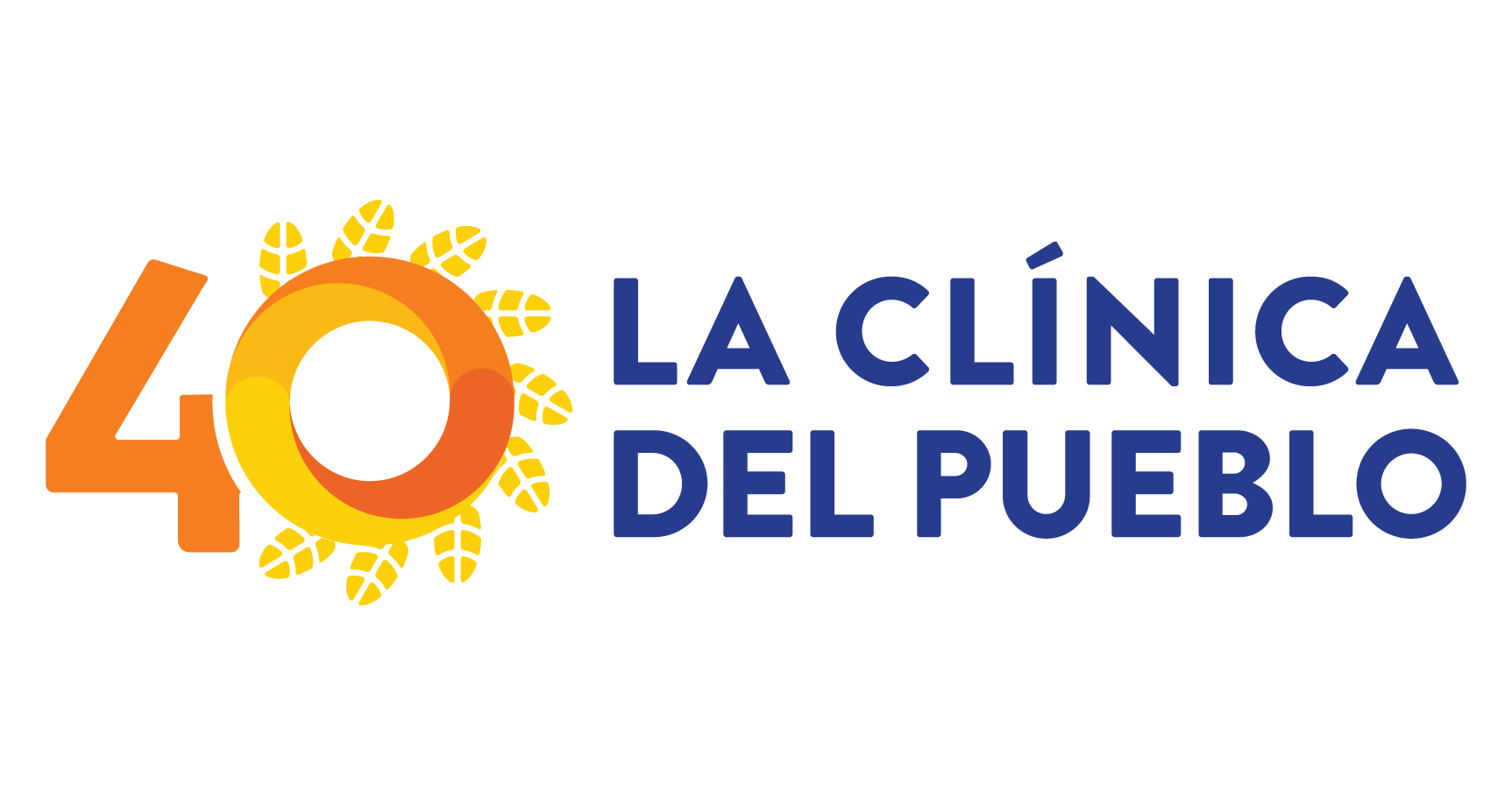
We are excited to share that this year, La Clínica turns 40, and through the input of staff, supporters, partners and patients, we arrived to the following logo to recognize our 40th:

1.Feathers: The use of feathers as in the original logo aligns with the overall branding and serves as a consistent identifier. They represent energy, action, reaching out to the community, justice and our work towards health equity.
2.Number 40: Integrating the number 40 into the design of the sun creates a cohesive and unified image, that marks this milestone.
3.Sun: The circular design within the sun symbolizes the community as an integral part of La Clínica, unity, progress, and evolution through the integration of four distinct elements symbolizing each decade.
The circle serves as a powerful symbol, not only representing a lens or telescope that enables us to examine our past history and reflect on the journey we have undertaken, but also as a window into the future, providing a glimpse of the untold story that we are yet to write
4.Typography: Retaining the same typography in the anniversary logo helps maintain its distinct and recognizable identity.
Words that come to mind when reflecting on our 40th year:

We could not have provided 40 years of care and community without you. Thank you for all the ways in which you fueled our mission and vision – through your advocacy, financial and in-kind support, participation in meaningful discussions, friendship, and solidarity! Our staff is planning several events for the opportunity to unite and celebrate, recognize, and reflect La Clínica’s work.
Stay up-to-date by subscribing to our newsletter: www.lcdp.org/subscribe
